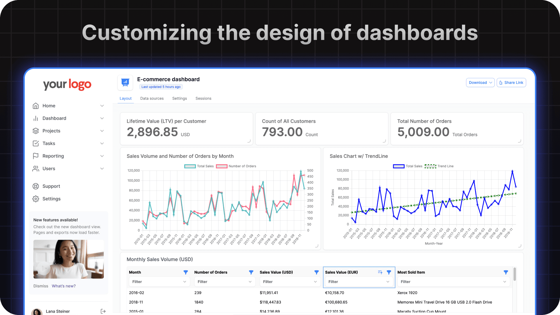
Customizing the design of embedded dashboards
This section will walk you through customizing the design of the dashboard once embedded in your product

You can easily make changes to the UI of your dashboard by heading over to https://dashboard.onvo.ai/dashboards/:dashboard-id/settings . Here you will find multiple options to customise the broader look and feel of the dashboard.

CSS class names
Whether you are embedding the dashboard as an iframe or if you are using the SDK, you can edit the CSS of all the components on the dashboard. The following are a list of some of the more common components you can customize.
/* WRAPPER STYLING */
.onvo-dashboard-context

/* HEADER STYLING */
.onvo-dashboard-header
.onvo-dashboard-header-title
.onvo-dashboard-header-description
.onvo-last-updated-badge

/* GRID STYLING */
.onvo-dashboard-grid-wrapper
.onvo-dashboard-grid-layout

/* CARD STYLING */
.onvo-chart-card
.onvo-dashboard-grid-handle
.onvo-chart-card-drag-handle
To target the same classes in dark mode, just prepend the .onvo-dark class name. The class names above would then look like the following.
/* WRAPPER STYLING */
.onvo-dark .onvo-dashboard-context

/* HEADER STYLING */
.onvo-dark .onvo-dashboard-header
.onvo-dark .onvo-dashboard-header-title
.onvo-dark .onvo-dashboard-header-description
.onvo-dark .onvo-last-updated-badge

/* GRID STYLING */
.onvo-dark .onvo-dashboard-grid-wrapper
.onvo-dark .onvo-dashboard-grid-layout

/* CARD STYLING */
.onvo-dark .onvo-chart-card
.onvo-dark .onvo-dashboard-grid-handle
.onvo-dark .onvo-chart-card-drag-handle
Last updated on